Wednesday 30 April 2014
Tuesday 29 April 2014
Ancillary Text - Digi-Pak

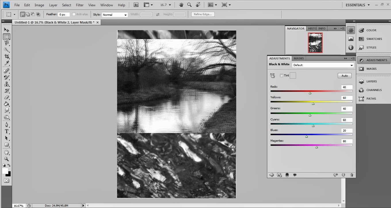
This is my finished product for the digi-pak part of the ancillary text. Throughout this part of the task, I intended to maintain the same kind of imagery in the back and middle covers that I had made in the front cover. This was done by taking additional pictures using my DSLR camera in the same places as the image for the front cover was taken. This gave a similar amount of light and contrast on the pictures so that when it comes to editing, they weren't completely irrelevant images. I used a digi-pak template which I had found on the internet (Google Images) which had six sections; this was so that it was appropriate for the type of medium that was advertised in the posters (an EP). The other two sections of the digi-pak use images taken from the music video, these seem appropriate for the final product as they maintain the dreamy feeling which comes from looking at the other images.
The production of this digi-pak was on the program Adobe Photoshop, this was because it is convenient to edit images and add layers when necessary. Although, these images were all created separately before being put together on this digi-pak template (original images shown on a blog post below). The first one which was made was the front cover which I had created some time before the rest of the digi-pak due to needing time to edit my music video. Secondly, I created the back cover. This was because I had already created a poster previously which used the same image as a background, however this was edited to appear much darker and build a stronger contrast with the front cover. When making this back cover, I did not alter much of the light other than inverting the colours; this made the whole image lighter and create a hyper-real appearance of water. In addition to this, there would be familiarity with the poster as some bigger fans tend to be curious about the use of artwork, moreso when it comes to Radiohead and their fame in having abstract imagery around their work. When adding the tracklisting, I used a font and colour which would contrast against the image behind it, yet keep a smoother layout for professionalism. Following the research that I had done earlier in relation to digi-paks, I understood the features which would appear on the back of a digi-pak cover. Therefore, the conventional features of barcodes, record label logo's and websites were added to the lower right as they are less important to the consumer than the tracklisting (which appears on the left third of the page).
I then went on to create a middle section which included another picture which I had taken alongside the front and back cover images. This however, did not feature water but rather a tree which looked over a nearby river. The connotations which I had in mind for these pieces of artwork was that each image was relevant to a person who features in the music video. The front cover being the main character who keeps going after the other takes an overdose. The back cover is relevant to the second main character as he hits rock bottom as soon as he discovers that he is in debt with dangerous drug dealers (hence the birds eye view). The middle section was created with the main drug dealer in mind as he is looking over at the two main characters as they drift away into a field of debt and self-destruction. Here, the water is indicating the decay of the characters. I altered the brightness of the middle section so that there was a little amount of greens and brighter colours to be distinctive against the other artwork. I also made sure there was little contrast and adjusted the levels. The final touch was adding the lyrics to Exit Music over the image as this is a conventional feature of inserts; this was placed in a dark blue colour to suit the darkness that the image gives off.
I then created the other middle sections to complete the digi-pak. This began with the blue tinted left cover (pictured top left), which was also edited using Adobe Photoshop. The image was taken directly from the music video as a screen shot, showing the secondary main character gazing out of the window (0:43). This appropriately reflects the band as a large majority of their songs use a slow tempo which features some shoegaze influence. I believe that this image gives a third person perspective on how the listener could be using the digi-pak; also using juxtaposition to create a sense of verisimilitude in those who may have watched the music video before purchase. Once the image to be used had been established, I placed lyrics in the top right (as this is the first area that the viewer will see in relation to the left third rule). The lyrics that I placed here are to apply to other songs which would be included in the EP if released (pasted from Floorpunch - Washed Up at 18). After this, I used a gradient map to change the colour scheme to match the imagery of the other images of the digi-pak. This was made to an indigo colour to be distinctive against the original screenshot, yet similar to the following cover.
The final cover which I made for the digi-pak was another screenshot taken from the ending of the music video (4:39). This shows the main character laid on the floor at the climax of the video. I believe that this applies to the imagery of the other covers as it maintains the dark outlook that comes from the other pictures. I added a thank you list to the bottom of this image as this is often a feature which comes from within Digi-paks; within this list, I included my teachers and actors who feature in the video. I used another gradient map on this image to make it black and white, usage of the gradient feature helped me edit the focus of blacks and whites within the image to make the perfect tone. There is a lot of darkness in this image to assist the other images in the digi-pak and create a darker focus on the events which happen in the music video. This is also similar to the inserts from Radiohead's single of Just, which features similar events in the video.
Monday 28 April 2014


Sunday 27 April 2014
Ancillary Text Front Cover #1

Initially, I had planned on creating a collage of other
images to create something which ran in the style of Radiohead’s Hail to the
Thief artwork, yet this would be very hard to get right. The idea felt a little
far-fetched and time consuming for a concept which did not greatly apply to the
themes of Exit Music (For a Film), or OK Computer for that matter. Following
this, I decided that the ancillary text for this would be more suited to
recreate an EP (extended play/single) of Exit Music for a Film rather than making
an alternative cover for the album which it features on.
Through my photography interests, I decided that getting an
original image for this would be a lot more eye-catching and interesting to do.
This meant that I had to base the image on something that would apply to the
themes of the song and the tone that it is played in. As the song is very
gradual and builds up to an ending, a river seemed like a good idea. This also
works with how peaceful the song is for most of the duration. Once I had set
out to get the photos taken, there was too much light as it was mildly sunny
outside. The outcome of this was that it appeared to be the artwork of an
electro-house artist or a band with positive ideologies (which Radiohead
certainly aren’t). This meant that the image had to be taken on an evening
where there was slightly less natural light.
Once the images had been collected, I proceeded to edit them
on Adobe Photoshop, although websites such as ‘dafont’ and the Microsoft Paint
app were also put to use. The process of
creating the first copy of my front cover is shown on a previous blog post
which explains the steps that I took to creating the cover. I found that
creating this was fairly easy due to my knowledge of these programmes from
studying Photography last year. I also had ideas of covers to use as I have
always found artwork of releases an interesting choice.
Saturday 26 April 2014
Ancillary Text - Record Label
Record Label

Shown above is my final product of the record label logo which I had created. Whilst creating this, I had other record labels images in mind which normally featured a bold and simplistic type of format. This, in most cases, was when the label was very well established and maintained a professional appearance. As a result of this, my main inspiration for the appearance of the logo was Universal; one of the largest major record labels in the world. Their logo is recognized everywhere in both the music and film industry as their conglomerate runs successfully throughout the two fields. Because of this noticeable imagery, I used the image of a globe as the background for the logo to create 'Worldwide Records', the name of the label came to mind whilst editing the picture.
The first step I made upon creating this image was searching for a clipart picture of the world. I wanted this to be 2-dimensional so that there was not too much to focus on, keeping the simplistic approach. The image that I found took a lot of cropping and changing of colour so that it was a simple black and white picture in the background. I did not want too much colour so that it maintained a professional appearance and allowed the font type to stand out from the rest. When deciding which font to use, I looked at my initial research which I had done to establish which was most appropriate to maintain this professional appeal. Although a lot of labels simply used images without text, I found it appropriate to state the initials of the label on the logo for a bigger sense of recognition seperate to Universal; I did this in burgandy writing to make the initials 'WW' more bold. The positioning of the initials was to convey the sense of the letters being across the world meaning that the label is spread worldwide. As I had used Adobe Photoshop, I felt as if there was a lot that I would be able to do with this image although the element of keeping it simple was essential. The final touch which I made to the record label logo was inserting a line underneath the top 'W' to match the two together and connote a sense of being connected with the labels audience.

Friday 25 April 2014
Ancillary Text: Poster
Final Product

My final poster for the ancillary text was created using Adobe Photoshop as the software. I intended to create something which used images from the front cover and digi-pak yet giving a sense of mystery to those who would be purchasing the album. This is because the band Radiohead often display themselves as mysterious people both in their artwork and lyricism. Because of this, I excluded the title and artist name from the initial front cover which is displayed on the poster so that the artwork was more outstanding. The band name and title are shown above and below the artwork so that it is more clear to the audience of what the poster is advertising.
I chose the font for the title/subtitles 'Radiohead' and 'Exit Music (For a Film)' by investigating the works of other artists of a similar genre. I came to the conclusion that this was an appropriate font as it does not look too modern which maintains the vintage appearance which I have tried to convey throughout the ancillary texts. The use of italics on the lettering makes the titles appear to be somewhat outstanding as it is the only area of text on the page which uses it. Beneath the titles and subheaders, the lines which read 'New EP Out In Stores Junes 21st' and the reviews from other magazines use a conventional font style as it is easiest to read for the audience. The traditional type of font also connotes the vintage appearance.
When I was researching other posters, I found that it was appropriate to use a background which either contrasts with the artwork or is a larger version of the artwork itself. As the artwork is rather abstract, I believed that it would not be appropriate for an enlargement to dictate the entire poster. Therefore, I used an image which I had taken myself of water to contrast against the artwork whilst using the same kind of theme. When I was first editing this, I thought of making the entire poster in grayscale so that it had a strong vintage appearance to it. I also had made the artwork cover the majority of the top half of the page. Once I had gotten further with this idea (shown above), I decided that it was too bland to feature in magazines and newspapers; this meant that I had to make the artwork in colour to contrast against the grayscale background. Additionally, I had shrunk the artwork so that the background was also a bold feature.
Whilst editing the poster on Adobe Photoshop, I realised that the contrasting of colour and grayscale was essential to make the advertisement stand out; in addition to this, I altered the levels so that the colours went together. I used tools such as colour adjustments and contrasting to make the background appear darker yet not too dark so that the waves in the water were still noticeable. I believe that this adds to the dreamy feel that the audience receives from the image as a whole. Finally, I added the reviews from exterior magazines, these were determined through my knowledge of which magazines often review the alternative rock genre of music. The positive reviews were essential as many people rely on these companies to recommend them music accustom to their music taste, if the right review sites claim that an album is good, it is likely that it will increase sales. The record label logo was pasted in the bottom corner so that there was a sense of recognition, normally labels insist that their logo is included on the bands work. Finally, the logos of Twitter and Facebook were added so that the audience can find the album on social networking sites as another form of promotion. In the bottom left corner it reads '#ExitMusic', this is so that people can use this hashtag on twitter to find information about the release and also promote it by making it trend on the site.
Friday 11 April 2014
Evaluation
Media Evaluation
Throughout this task in media studies, I learned a
lot about framing, editing and the general production of filming a music video.
This broke a lot of expectations that I had and although using heavy planning; there
were some cases where improvisation was needed for a better result. I filmed
the music video with a HD video camera and tripod and used the editing software
Final Cut Pro on Mac format. For the ancillary text task of creating a poster,
digi-pak and record label for my product, I used Adobe Photoshop to combine my
images that I had taken on my Nikon D3000 DSLR with all necessary features to
create a convincing final piece.
Planning
At the end of studying AS media, we performed a
brief introduction task which involved filming a shot-by-shot remake of a
section from an existing music video. In my case, this meant filming around a
minute of the music video for ‘Ed Sheeran – A Team’, a song and video which I
was initially unfamiliar with. Eventually after coming to terms with the
process of framing, panning and other aspects of filming, I put together the
video along with other members of my group. The task began with creating a
storyboard which analysed the shots that had featured on the video and planning
how we could recreate the shots maintaining the same cinematography work and
mise-en-scene. After researching this and assessing where the edits take place,
we proceeded to begin filming at a local park close to Wyke. It took two shoots
to finish the filming where we had to do a lot of improvisation in terms of
props and getting the appropriate camera angles (there were several long shots
which weren’t identical to the original shot as it was a very busy park). As it
was not a complete music video, the process in editing it was also fairly quick
and was done using Final Cut Pro via Mac. This gave me a reasonable insight to
using editing software which was useful when filming my final music video.
After returning to college in September to begin my
year in A2, the preparation for filming the music video had begun fairly
quickly. At first I had planned on creating a music video for the song ‘Pile of
Dead Horses’ by ‘Full of Hell’ but the duration of the song was too short and
they are a bizarre genre where none of the bands related to it have any music
videos to analyse the conventions of. Therefore, after a long think I decided
to film a music video of ‘Exit Music (For a Film)’ by ‘Radiohead’. As I have
always been a huge fan of the band and song, it seemed a fitting choice; I also
had a lot of ideas for the music video upon listening to the song which made me
feel confident about choosing it.
I then began researching other music videos from
artists who are in the alternative rock ‘scene’ at the moment. When analysing
these music videos, I took note of the uses of cinematography, mise-en-scene,
editing and sound where I found some similar conventions that the videos
followed. The first being Interpol; a band that I had seen video’s from ever
since I was quite young. As it had a strong meta-narrative throughout the
video, cinematography had a large emphasis to reflect the situations and
emotions that the characters were feeling. The personal extreme close-up’s and
fast editing upon tempo change in the song were also noticeable to make the
video entertaining in a way which would appeal to the appropriate audience. I
also analysed another famous video from Radiohead (No Surprises) and the latest
video by The World is a Beautiful Place and I Am No Longer Afraid to Die who
are slightly less well known than the other two. Funnily enough, they all
followed similar conventions although projecting them in different ways. I gave
these videos a brief LLIAR analysis which addressed the main features; these
can be found on my blog (http://joeburrowsmedia2.blogspot.com).The
next step involved analysing the meaning behind the lyrics for Exit Music, I
also looked through comments on YouTube, Google and miscellaneous blog sites to
find what the true meaning behind them were; this lead to much confusion and
false ideologies. Finally, as another preparation, I timed how long each line
of the lyrics lasted. This was so that when it came to filming and the parts
with lip-syncing come into the shot, the timing for it would be accurate.
I was then at the stage to gather some market
research for the music video which involved getting two people from my class to
form a focus group which asked questions which would be relevant for the
creation of my product. These questions included:
-
Have
you heard of any of these bands [Radiohead, Interpol, Joy Division, Title
Fight]?
This was for the purpose of
understanding whether they were accurate sources of information for the
questions (e.g. fans of the above bands).
#1:
Yes, Radiohead
#2:
Yes, all of them.
-
Do
you feel this band is represented appropriately throughout the media?
This was to understand whether the
current music videos which these bands produce are appealing and make them want
to purchase their music.
#1:
Yes.
#2:
Sometimes.
-
Have
you watched a music video from any of those bands?
#1:
Yes, Radiohead.
#2:Yes,
Radiohead.
-
What
was the last music video that you enjoyed watching?
#1:
‘What does the fox say’
#2:
Tyler the Creator – Simale
-
What
is your favourite part of a music video (e.g. fast paced editing, interesting narratives,
relevance to yourself)?
This was to establish which
features would make my video entertaining for a general audience.
#1:
I prefer the music, don’t normally watch videos.
#2:
Interesting narratives.
Once this research had been gathered, I had to
decide on three different concepts which I could use for the final music video.
The ideas that I had all revolved around the same message that the writer of
the song, Thom Yorke had in mind when making it; that the people in the song
should have run away when they had the chance. This is why it was made to
feature in Baz Luhrman’s film of Romeo & Juliet although it was originally
focused on the people that the concept album of OK Computer was based on. As
the song gives the listener dark denotations, these ideas all involved more
controversial topics such as murder and manipulation, however I chose to make
it around the idea of drug dealers on the run. Aside from it being distinctive
from the original use of the song, I thought the theme of young drug dealers
would appeal to a large amount of Radiohead’s current audience whilst having a
postmodern effect by breaking down the use of conventional narratives.
After that point, I decided to take note of possible
ideas for the way that the narrative would unfold in the video and begin
creating a storyboard. This involved drawing the framing of the shot and the
nature of what would be happening in as much detail as possible. Next to each
shot, there would be a brief or graphic description of what would be happening
in terms of cinematography, mise-en-scene, editing and sound (the four main
conventions of filming). Every aspect of this would need to be considered in a
rough plan so that there is a framework for shooting when it takes place. Throughout
my storyboard, there were initially fifty-two shots for the duration of the
four minute and twenty-eight second song. The shorter amount of shots was
considered to be a result of the slow tempo of a large section of the song and
controversial nature of the video which needed longer shots for more impact.
I started the storyboard with an introduction which
included two main characters discussing the situation that they are in. I felt
that this scene was necessary as it established the situation that the
characters are in and explained to the audience what the narrative of the video
would be based on. I described that these shots would be on the screen for a
reasonable amount of time as it would reflect verisimilitude of the conversation
and lethargic emotions of the characters as they feel powerless towards the
situation that they are in. Within the storyboard, there were some boxes left
blank such as ‘sound’ in a lot of cases as there would simply be the music
playing in the background. After the scene is shown inside the car where the
characters are talking, the music begins to play with the secondary main
character gazing out of the car in a vacant mindset. I mixed the shots up
between the storyline playing out and another actor playing the guitar and
miming as a replacement for Thom Yorke. The shot timings were then written out
as a guideline for how long each shot would be on the screen for after editing,
however when filming the shots had to be filmed for a much longer duration for
more convenient editing. Using the program Windows Movie Maker, I photocopied
the storyboard and cropped the writing to edit the images together making an
Animatic. The Animatic was altered to have each shot last the same timing as
the planning that I did.
I found that throughout the themes which are featured in the video, the moral panic theory by Stanley Cohen is relevant. As the narrative uses a postmodern viewpoint of having the antagonists as the anti-hero's; it is likely to be frowned upon by some audiences. Binary opposites are not used within the video which makes it hard to distinguish which side the viewer should be on, yet the main focus is on the two main characters which makes them appear to be some sort of protagonists. The plot uses controversial themes which reflects the way in which some of the lower class are attempting to earn money and following drug related events in recent history, it could feed the already present negative ideologies and stereotypes of youth.
I found that throughout the themes which are featured in the video, the moral panic theory by Stanley Cohen is relevant. As the narrative uses a postmodern viewpoint of having the antagonists as the anti-hero's; it is likely to be frowned upon by some audiences. Binary opposites are not used within the video which makes it hard to distinguish which side the viewer should be on, yet the main focus is on the two main characters which makes them appear to be some sort of protagonists. The plot uses controversial themes which reflects the way in which some of the lower class are attempting to earn money and following drug related events in recent history, it could feed the already present negative ideologies and stereotypes of youth.
Before creating my music video, there was
preparation which I needed to take such as the health and safety precautions.
Due to the nature of my music video however, there were not many aspects which
needed to be taken care of other than placing signs to warn the general public
that we were filming and unlocking a door when Sam is shown knocking it down. I
also did a draw-up of the clothes that I intended on the main characters’
wearing for the purposes of mise-en-scene connotations. These were mainly
casual wear for the sake of realism but upon filming we decided on different
clothes. This was so that the characters in the story appeared to have some
form of wealth so that it didn’t stereotype drug dealers as people of a lower
social class. Breaking conventions such as this are what I hope to do more
throughout filming as it gives a different perspective to that which is often
shown by the mass media. Tessa Perkins discussed stereotypes in great detail
addressing the idea that they do not often change amongst others. In a
postmodern era, I believe that it is important to disprove the dominant
stereotypes which are used throughout society.
My planning then lead to deciding which props would
be needed for the shoots based on the storyboard. As the feature was based on
drugs, there would be bags of fake drugs needed as well as a large amount of
fake drugs to appear in some of the mid-section shots. These were made out of crushed
up salt so that they gave the image of cocaine or other white powdered drug
(only referred to as ‘blow’ in the dialogue). There also needed to be a guitar
for the sub-plot/secondary narrative which involved Jamie playing along with
the song; a car for the introduction and scene with Jamie confronting Sam and a
fake gun. I had initially planned for shot six to include Jonny appearing to be
smoking a bong for a gritty effect on the video, yet it was hard to acquire one
and the e-cigarette seemed like a reasonable substitute. Further into the
planning, the locations were decided upon where most of the video was filmed
near my estate. This was mainly because it is a quiet area which can minimalise
the chances of health and safety risks and made the shooting go smoother. It
was also convenient in terms of not having to travel in a car saving fuel money
and time.
Production
After the planning had finished, it was time to rent
the camera and tripod to begin filming. As I had previously studied
photography, framing of the shot came naturally to me. However, I repeated each
shot at a different angle so that I could decide upon editing which was better
and suited the nature of the shot correctly. This proved to be beneficial
because often in my storyboard, I planned on framing a shot in a way which did
not keep continuity throughout the cinematography. In cases where a shot shows
a character walking, I often found it better when filming to follow the actor
with a handheld camera to make it seem as if the viewer is walking or running along
with him. The mixture of dynamic and still camera shots also keep the narrative
going in a way which is entertaining and fresh in terms of cinematography. The
first shoot took place on the 15th December where I decided to film
a middle section of the music video (including shots 19 – 30). Whilst filming
this footage, I had a lot of ideas running through my head about making the
main character appear to be in a panicky state. Luckily, Sam was very good at
acting out distressing emotions towards the camera to make the footage appear
realistic. When the shots shown at the doorstep of the secondary main
character's house were done, it is the body language and facial expressions of
the main character which make the scene show a degree of verisimilitude. In terms
of cinematography, the shots begin with a back shot of Sam knocking at the door
as if we, as a viewer are stood there with him. This changes to a close up of
him looking very worried and paranoid as if something could go wrong at that
very minute. When he realizes that nobody is answering the door, the knocks
become more vicious and urgent. This is shown effectively through a medium
close-up which shows his clenched fist making it look as if he is doing a very
loud knock. The extreme close-up of his head against the glass door makes his
emotions seem clear when watching the video as he appears to have given up all
hope.
When he tries forcing the door open to get to the
secondary character, the door was left open whilst we were filming so that the
door didn't actually break. Because of this, the shot took a lot of retakes to
make it look like he was genuinely breaking the door down; this meant that the
door had to open at a specific speed. The main character finally reaches his
friend in the next scene to find him overdosed on the drugs whilst laid on his
bed. This is effectively shown by an over-the-shoulder shot leading to an
extreme close-up of him laid on his bed appearing to be lacking much life. Sam
is then shown trying to wake him up but he appears to be dead. When the scene
in my room was filmed, I used the tripod whilst on a stool to get the over the
shoulder/two shots flawless. This is because the main character, Sam, is over
six feet tall which made it hard to shoot when the tripod only reaches around
three/four foot. Following this, there is a blur cut used as a transitional
effect on Final Cut Pro, this makes it seem that time has passed whilst Sam is
gazing at Jonny’s lifeless body. A pan is then used as a point of view shot to
show the character as he is staring at his dead friend. I had to carefully
consider the lighting in my room which felt more appropriate to use smaller
lamps as the main lighting was far too dark to make the shot work with the
other ones filmed. The scene ended with an extreme close-up of the drugs on a
desk in the room. For mise-en-scene purposes, I shot the CD case with the white
powder on next to a sticker and patches of tobacco to convey the characters' messy
personality more. In a lot of movies and
TV shows (namely Nil By Mouth, Skins), when drug abuse is shown it is normally
in a realistic club or domestic setting where they are normally taken in real
life. I intended to convey this in my media reality through filming these shots
in my messy room.
Upon editing this shoot, the cuts were fast in
conveying the state of rush that the character is in to tell the other about
the trouble that they are in. I believe that this shows human emotions for the
characters which are often hard to represent in music video contexts as there
is a lack of dialogue. Cinematography is often used throughout videos to guide the
viewer through the narrative; I intended to do this through the long range
angle that I showed Sam running at towards the end of this sequence showing the
speed that he is going at. I used a fading edit on shot twenty-two to create an
illusion of time going past, the mystery to this edit is that the audience does
not know how long the character was stood with his head against the door
admitting defeat. Features such as this are vital to me in conveying human
emotions through the narrative where body language can be the difference
between a person seeming positive or negative about their situation. Emotional
attachments to the characters create a sense of belonging which is referred to
by Blumer and Katz’s theory of uses and gratifications; this describes the
psychological and social needs that the viewer places on a media film.
The second shoot took place on the 26th
February which was over a month after the first. I used Jamie to act out the
shots throughout the music video which featured the vocalist/guitarist (Thom
Yorke) playing the song in sync with the music. This included shots 12, 13, 31,
32, 33, 44 & 51 from the storyboard. Most of these shots follow a similar
style in which it is a medium to extreme close-up of the vocalist/guitarist
playing along with the song in a dark atmosphere with accurate lip-syncing
used. This made it fairly easy to film once the actor was familiar with the
lyrics of the song. Jamie is an avid guitarist who has previously played in
miscellaneous bands which made it a lot easier to gain a realistic appearance
whilst he is shown playing guitar. This prospect of filming the artist playing
along with the song in between breaks in the narrative is a conventional
feature of the alternative-rock genre which I discovered in my initial research
(used by bands such as Title Fight, Interpol and The Strokes). This idea was
then developed to match the dark imagery that the song gives across to add dim
lighting to the footage; this was however enhanced using an effect in Final Cut
Pro. I decided to use a lamp for lighting as well as the wall lights as this
way there would be presence of shadows in his face. This would allow
mise-en-scene to convey the negative connotations within the narrative and
song. Before beginning the filming, we went through the lines that he had to
lip-sync so that his timing was correct. Once this was done properly, we
started filming from shot 12. This shot only featured him playing the guitar
from a medium close-up shot (only showing the top half of his body), the
shadows covered some of his face intentionally so that his entrance was similar
to that of a performer keeping mysterious. Until mid way through the video it
is not clear to the audience that the same actor playing guitar is the same
person who is the main drug dealer. This sense of mystery is often used in real
media texts and becomes apparent towards the end, this is generally referred to
as a ‘twist’. Upon editing, these shots were scattered around the video and
often come in abruptly to cut the narrative into smaller sections.
The third shoot filled in certain gaps which we had
missed due to not filming in the order that it is shown on the video. The shots
which were filmed in this shoot were 5 – 11 then 34 – 37; this started with
shot five which featured Jonny staring in the mirror at himself as a
self-reflective shot. This was filmed in a darker setting so that it created an
eerie feeling to those watching the video; it was also shot without a tripod so
that it had a creepy handheld camera feel to it (similar to Blair Witch
Project). Shot six showed Jonny sat on the bed whilst smoking an E-Cig; this
was used to mimic the appearance of a joint (marijuana cigarette) which was
originally going to be replaced with a bong prop. I then used the prop of cut
salt that I had used in previous shots to create the illusion of hard drugs.
These were arranged into 'lines' which are often used as a way of taking
cocaine from drug abusers and placed bags of the mixture around it to show the
appearance of drug dealers. Shot seven showed an extreme close-up of this
mixture to show that it was in his house and that he partakes in this drug
abuse as well as the other main character who is shown snorting it in his own
house in shot eight. I decided that this would be appropriate as a longer shot
to reflect the brutality of taking these drugs and how it is not something
which can be done to 'chill out'. We effectively showed this through the
mise-en-scene where he had a lot of books surrounding him to reflect his
stressed mentality. He also leaned back once it looked like he had taken in the
line and drops the note after (through adrenaline). The inspiration from that
shot came from the film Pulp Fiction where characters snort lines which are too
intense for them, this creates a sense of realism. In terms of cinematography,
the camera pans backward with him as he leans back; this is all performed in a
dark setting to show the attitudes of both drug abusers.
In shot 34, it carries on from the filming that we
did in shoot one where Jonny has overdosed on drugs and Sam is in a state of
emergency trying to deal with him. This shot shows Sam going through a bag in
an attempt to find Jonny's phone to call an ambulance. I framed this shot so
that Jonny is still in the picture to remind the audience of the story as it
has a shot of Jamie playing guitar with the song before-hand as a subplot. Shot
35 emphasizes Sams actions with an extreme close-up of the phone as he begins
to dial 999 for emergency services. I believe that the shot of the phone also
reinforces the idea that this is filmed in the modern day (as it is shown on an
iPhone 5), dealing with relative matters for the audience and creating
verisimilitude.
As there was still a large section in the beginning
and ending which still had not been finished, editing these sections was like
matching pieces in a jigsaw. The first shots had been trimmed down by the
original timings which I had placed on my blog as I felt once they had been put
together, the image had been on the screen for too long and it could lose the
viewers interest. The first shot of Jonny gazing into the mirror was made to
have a sense of self-reflection and regret for the situation that he is in;
this is to make the viewer feel a kind of sympathy for the character. Often
when these handheld shots were filmed, it was hard to keep a medium of having
an unsteady camera and not making it appear to be simply poor filming. These
scenes with Jonny sat in his house were filmed this way to make the viewer feel
uneasy at the thought of self-decay through drug abuse. In a sense, the morality
that my music video’s message carries is somewhat conventional of videos in
this era. These are more conventional as a result of companies such as BBFC and
BARB which regulate any graphic drug portrayal to carry a message and not make
it seem attractive so that it can be aired on prime time television/stay
appropriate for younger people. The second part to this shoot which carried on
from shot 34 to 37 was edited in to start following a section of miming from
Jamie. This starts when the drums begin in the song to liven the atmosphere somewhat;
it also marks the start of the climax of the narrative. An over the shoulder
shot is used before an extreme close-up of the phone so that it eases the
audience into seeing things from Sam’s perspective.
The fourth shoot was very brief as we only filmed
shots 38 – 42 with the use of an extra (Paul) who was available at this time. We
started off with shot 38 which was down an alley where the narrative involves
Sam selling drugs to somebody in an attempt to earn the money back with which
he owes. The first shot shows him stood lighting a cigarette down the alley
where the mise-en-scene conveys a feeling of disorder through graffiti shown on
the walls. On the 40th shot, Paul comes into the frame walking towards Sam to
buy drugs from him. In his role, I told him to look as casual as possible so
that he appears to be another random person from the streets. I took this shot
from a range of angles so that I could give the best impression of a drug deal
possible. Shot 41 shows an extreme close-up of Sam’s hand as he passes the bag
of drugs over to him. This is a very short shot so that it shows how wary both
of the characters are during the drug deal in case anybody is watching nearby.
The last shot that we filmed in this very short shoot was the 42nd. This shows
Paul walking away as Sam walks in the opposite direction down the alley; this
was the longest shot in the shoot that I filmed. It also creates a sense of
paranoia for the character with a lot of focus on his facial expression. It was
filmed both on a tripod and on a handheld camera in a range of shots.
I began editing this section into the video by using
a transition which used a flash of light to show that it is another time in the
day. In this scene, Sam has a different set of clothes to make it seem
realistic and as if he had gone home to calm down about the events which had
taken place. I filmed Sam from a range of angles as he lit his cigarette and
stood waiting for the drug deal to commence. The shot I chose to start it was a
zoom on him whilst he was stood lighting it, this quickly cut to him looking
around to show that something is about to happen in the plot. As it progresses,
there are fast edits on the drug deal to show that neither of the people wishes
for anybody else to oversee the transaction.
The final shoot was the longest which involved getting
a toy gun to use for the shoot and getting Sam to bring his car to feature in
the areas with Jamie (the drug dealer). A lot of the initial planning from the
storyboard and animatic were replaced with different shots to keep continuity
throughout the music video; however I tried sticking to the original plan in
terms of narrative. I started filming on shot 14 which was initially planned to
be a shot of Sams shoes as he is walking down the street. After gaining a lot
more understanding on cinematography and what makes a shot more attractive, I
decided that this was too boring so the shot showed a medium-close up of Sam's
back as he walks down the street. This was then joined with another medium
close-up from the front. In the storyboard, I planned on having two people in a
car following the anti-hero but this changed when the other person who was
going to act in the video was too busy on most of the days that we planned on
filming. I came to the conclusion that he was quite unreliable and the filming
would go smoother with only one antagonist; therefore I just asked Jamie to do
the role instead. With this decision, shot 15 featured Jamie sat in the car at
a medium close-up keeping the car in the frame of the shot. His facial
expression maintains a strong look at Sam as if he is furious about not getting
the money.
Following this, the next shot shows Sam walking
towards the car in an attempt to talk his way out of the circumstances. I added
subtitles to the shots which continue where Jamie asks where his money is; this
leads to a conversation that they both have. The subtitles were added using a
title feature on Final Cut Pro and edited over the video to be shown on the
screen for as long as they appear to be talking. I wrote some dialogue for Sam
and Jamie to say in the shots, although it was not audible in the finished
product and their lip-syncing is only present. The next shot included Sam
telling Jamie "I need more time" through the car which included a
range of angles. My personal favorite was an over the shoulder shot of Jamie as
he stares at Sam saying his lines which was added to the final product. That
shot then lead to Jamie saying "If I don't get it by six you're dead"
at a medium close-up. In this conversation, the editing allows for short shots
of both the characters facial expression as if we are faced with constant
point-of-view shots. Following Jamie’s line, Sam then appears to be
disappointed as an extreme close-up addresses his emotions at the time he hears
the message from Jamie. Following this, the next shot shows Sam beginning to
walk off away from the car and quickly cuts to the next scene of him running (which
was covered in the first shoot). The mise-en-scene in this shot shows his body
language as hesitant where he turns around to make sure the drug dealers car
has gone and sprints away.
In the second part of the shoot, we proceeded with
shot 43 which shows Jamie emerging from the bushes once Sam had finished his
drug deal (shown in previous shoot). Shot 44 was filmed in a previous shoot as
it features Jamie singing along with the song in one of the main lines, thus we
proceeded with shot 45. As this was part of the climax of the music video, I
found it necessary to make some additional shots so that the editing was fast
and the viewer feels like part of the action. I added an extreme close-up shot
of Sam's look of fear after shot 44 which brought the audience back to the narrative
from the shot of Jamie playing guitar. As it continues, Sam is shown running
away from Jamie. This is shown from a long range including both characters as
it occurs. I filmed this from a variety of still angles and dynamically using
the handheld camera to add tension. This will give me a range of shots to use
when editing them together to appropriately convey the fear that would be going
through Sam's mind at the time.
The perspective then shifts to Jamie as an extreme
close-up of him reaching for a gun in his pocket is shown. This was then
followed by a medium close-up of Jamie holding the gun out at Sam whilst he is
running away. I used this shot (although it may be unrealistic that a drug
dealer would hold a gun like this - or at all) to create a hyper reality within
the text and make the video 'spring to life' in the climax of the song.
Following this, there is an over the shoulder shot of Jamie as he is aiming at
Sam running down the alleyway where in the same shot he shoots to kill. I
filmed this with the intention of it appearing as if the viewer is staring down
the aim of the gun themselves with the antagonist; with this shot I edited a
gunshot to the shooting. I did this by downloading a short video (taken from
detonationfilms.com) of a gunshot and using a blend tool on Final Cut Pro to
make it join with the actual action from the shot. This was then trimmed and
grouped with a gunshot sound from the software to create a realistic shot from
the gun. After Sam falls to the ground, Jamie is shown walking away around the
corner in an exaggerated walk as if he thinks he is of great importance or that
he is a dangerous person. This was also filmed using multiple camera angles so
that I could decide which one effectively portrays Jamie's reaction
appropriately. With these shots, I made sure that Jamie was still carrying the
gun so that the mise-en-scene reflected his evil persona. The final shot which
I did in this shoot showed Sam laid on the floor dead whilst members of the
public's legs and shoes were in sight walking past him; this was done to create
the impression that nobody who sees him on the floor wishes to get involved or
help (as with a lot of cases in real life).
To maintain the precision of lip-syncing, I placed
the shot of Jamie singing along with the song after he appears at the end of
the alleyway to kill Sam. This was strategically done so that it gives the
audience a few seconds of anticipation waiting to see what happens after Jamie
has finished singing and the dealer returns. It then cuts back to Sam’s blank
facial expression as he feels sheer fear, this is a good shot to return to the
narrative on as his body language expresses a lot about what he is feeling at
that point. When running away, I used another handheld shot so that his state
of panic is clear to the audience and it seems more intense. There are then
very fast edits from there til Sam is shown shot to the ground; this is to show
how fast things may appear to the average person when living in fear. Jamie is
shown walking off in shots which last approximately two to three seconds which
are much longer than the ones which feature before. This is to show to the
audience that the end has been reached and the villain was successful besides
the main characters’ efforts. The final cut shows Sam face down on the floor
which lasts for nine seconds before the credits which read the title of the
song come up. I mainly used this final shot to end the video appropriately and
provide a shocking outcome. The use of extras shown walking past his body was a
somewhat personal effect which indicates that not a lot of people will get
involved if a person is in need. The credits have the same appearance in both
the beginning and the ending to display familiarity throughout the video.
The sixth shoot finished the music video as it
featured the introduction that comes before the music actually starts. I left
this part of the video til last as it would be the hardest part to film and at
the start of filming, there was still a lot which I had left to learn. This
part of the filming took place on St Margret's Close in Driffield as it is an
isolated area and there was not likely to be any distractions other than a few
children playing nearby. The scene takes place in Sam's car where him and Jonny
are discussing the situation that they are in to establish the narrative that
takes place throughout the video. As this introduction did not have any of the
music video audio over it, dialogue needed to be written. The audio was
recorded in one shot (although it took many to get the pace and pitch right) as
when editing the sound, it was easier to separate the sound and video so that
there was not different levels and background noise in each shot. The script
was as follows:
S:
Did he say he'd give us more time?
J:
No mate he's pissed off.
S:
What are we going to do?
J:
I don't know, but we need to shift this blow thick and fast.
S:
No more getting high off our own supplies then.
J:
Tell me about it, I have a bad feeling about this.
I decided to alter the shots which I had initially
planned on doing with the storyboard. This meant that the video started with an
over the shoulder shot of Jonny walking towards Sam's car to let him know about
the situation. I believe that this provides a personalised effect for the
introduction of the video. I filmed this shot from a still angle using a tripod
and again whilst walking with Jonny using the camera handheld. Once inside the
car, I filmed an extreme close-up of Sam's face as he reads his dialogue. This
is so that it appears to be in the perspective of Jonny as he is having the
conversation. I then used the framing which i intended to use for the second
shot for which I sat in the back seat and did a two-shot of both of the
characters talking. The framing for the first shot is then used which gives a
frontal view of the conversation as they are both sat in the car. Jonny's
second line is used in this part where his body language gets more aggressive
when he emphatically stresses 'thick and fast'. I filmed an extra shot of Sam
placing his keys in his car to turn it on at an extreme close-up and an
establishing still shot of the car as it drives away. From these shots, the
audio was placed back to normal in accordance with each shot up until the music
begins playing. The final shot that we did in this shoot showed Jonny staring
out of the car window in a similar style to the self-reflective mirror shot
which I filmed in a previous shoot. I filmed this from the back seat using a
tripod to reduce camera motion, the character is only present in the right
third side of the shot to connote the world outside being bigger than him and
how he may feel that his situation is too much to handle.
I had filmed these shots, as with the rest, in a
range of angles so that I could decide which one is most appropriate when
editing. I decided on the still shot of Jonny getting into the car as there was
already a large amount of shots which used handheld recording and I wanted the
video to maintain a professional appearance. The shots which I added only
lasted around two seconds each but this was important to give a good view on
their conversation and life situation. I filmed the two-shot from the back to
last the whole dialogue which was then cut into two pieces and trimmed so that
it could feature before and after the frontal two-shot. This keeps the editing
fresh and entertaining. I trimmed the shot of the car turning on to three
seconds and allowed the establishing shot of the car driving off to last
slightly longer. This was because it allows time for the audience to anticipate
what is going to happen. The title was then edited in so that it matched the
one which I placed at the end of the film. After this, the shot of Jonny gazing
out of the window is shown for a longer amount of time so that the many
connotations can be taken in by the audience. It allows the viewer to feel as
if they are embracing this long, self-reflective car journey along with the
character which creates a personalised effect.
Audience Feedback
To gain feedback for my music video, I asked several
people who I knew had a reasonable understanding on this part of media. This
was because two of the people had been in bands which have had music videos
produced for them, and the other being a media student. This was conducted
through the social media site Facebook where I asked them to give me a brief
summary of the aspects that they enjoyed and disliked about the product; this
allowed me to assess any faults which I had and learn for the future.

As a previous band member, Charlie knows about the
production of music videos. He acknowledged the strong narrative and
complemented what was made out of little resources and budget. However, one of
the most important aspects of audience feedback is the constructive criticism
to where he said that the dialogue at the beginning was unenthusiastic and un-needed.
Due to both actors not having done much acting in the past, this is an
understandable area to point out however any future filming which I do will
feature people who are educated more in drama. The syncing issues with the
miming were something which I had believed in the majority of shots to be
successful once editing had finished. However, the syncing with shot thirteen
was not as successful due to the unenthusiastic miming from the actor which
made the shot harder to edit in line with the music.

Alex is a current band member who had very recently
filmed a music video, this made his feedback seem more useful. However as no
criticism was given from him, I could only acknowledge the areas which I had
covered successfully. Once again, the narrative was complemented and the use of
cinematography/camera angles was considered well done. Aside from the informal
way that he phrased it, I will consider using similar techniques in my camera
work in the future. The final comment addresses Jamie's intimidating acting skills.

The third piece of audience feedback that I had
received made another positive comment on the narrative. As he puts it, showing
‘the harsh realities of the UK underworld’ was one of my main intentions upon
creating the video so I believe that this was a success. He also approved of
the way the music works with the story; in my work, I wanted to make the
significant moments in the narrative come when the music intensifies or changes
in tone. Due to the comments of the audience feedback, I believe this was
performed well. His criticism was on the lighting of some of the shots however
these were not specified. For the future, I plan on keeping the lighting
similar throughout by filming in the same weather and using more natural light
in some of the shots filmed indoors.
Ancillary Texts
The first part of the ancillary text which I made was the front cover for my digi-pak. This was because it was the area of the ancillary task which I felt most confident about and already had some ideas in mind for it. After doing some initial research on the covers from bands such as Haim and Vampire Weekend, I analysed the main features which give the cover an attractive appearance. Through my photography interests, I decided that getting an original image for this would be a lot more eye-catching and interesting to do. This meant that I had to base the image on something that would apply to the themes of the song and the tone that it is played in. As the song is very gradual and builds up to an ending, a river seemed like a good idea. This also works with how peaceful the song is for most of the duration. Once I had set out to get the photos taken, there was too much light as it was mildly sunny outside. The outcome of this was that it appeared to be the artwork of an electro-house artist or a band with positive ideologies (which Radiohead certainly aren’t). This meant that the image had to be taken on an evening where there was slightly less natural light.
Once the images had been collected, I proceeded to edit them on Adobe Photoshop, although I used the website 'dafont.com' to acquire a font and Microsoft Paint was also put to use. I found that creating this was fairly easy due to my knowledge of these programmes from studying Photography in my first year. I began editing the image by creating multiple layers on Adobe Photoshop. From doing this, I created a distorted image which gives an uneasy impression upon seeing the river. From assessing other artwork from similar bands and the images which I had taken for the ancillary texts, I decided that without editing, this would be a far too bland picture to use for a front cover. To create the blurry effect, I duplicated the image several times and altered the opacity so that each image had a different amount of visibility. The original artwork to OK Computer does not use any photographs as it is an abstract painting (which hints at the themes of technology getting too far ahead of itself), yet I aimed to merge the modern day alternative rock stereotypes of cover art with Radiohead's abstract form of art.
When editing this in with the rest of the digi-pak, I intended to maintain the same kind of imagery in the back and middle covers that I had made in the front cover. This was done by taking additional pictures using my DSLR camera in the same places as the image for the front cover was taken. For some of the middle covers, there were screen-shots used from the music video to create a sense of juxtaposition within the digi-pak to bring the artwork together. This gave a similar amount of light and contrast on the pictures so that when it comes to editing, they weren't completely irrelevant images. I used a digi-pak template which I had found on the internet (Google Images) which had six sections; this was so that it was appropriate for the type of medium that was advertised in the posters (an EP). Following this, I created a back cover. This was because I had already created a poster previously which used the same image as a background, however this was edited to appear much darker and build a stronger contrast with the front cover. When making this back cover, I did not alter much of the light other than inverting the colours; this made the whole image lighter and create a hyper-real appearance of water. In addition to this, there would be familiarity with the poster as some bigger fans tend to be curious about the use of artwork, moreso when it comes to Radiohead and their fame in having abstract imagery around their work. When adding the tracklisting, I used a font and colour which would contrast against the image behind it, yet keep a smoother layout for professionalism. Following the research that I had done earlier in relation to digi-paks, I understood the features which would appear on the back of a digi-pak cover. Therefore, the conventional features of barcodes, record label logo's and websites were added to the lower right as they are less important to the consumer than the tracklisting (which appears on the left third of the page).
I then went on to create a middle section which included another picture which I had taken alongside the front and back cover images. This however, did not feature water but rather a tree which looked over a nearby river. The connotations which I had in mind for these pieces of artwork was that each image was relevant to a person who features in the music video. The front cover being the main character who keeps going after the other takes an overdose. The back cover is relevant to the second main character as he hits rock bottom as soon as he discovers that he is in debt with dangerous drug dealers (hence the birds eye view). The middle section was created with the main drug dealer in mind as he is looking over at the two main characters as they drift away into a field of debt and self-destruction. Here, the water is indicating the decay of the characters. I altered the brightness of the middle section so that there was a little amount of greens and brighter colours to be distinctive against the other artwork. I also made sure there was little contrast and adjusted the levels. The final touch was adding the lyrics to Exit Music over the image as this is a conventional feature of inserts; this was placed in a dark blue colour to suit the darkness that the image gives off.
After this, I created the other middle sections to complete the digi-pak. This began with the blue tinted left cover (pictured top left), which was also edited using Adobe Photoshop. The image was taken directly from the music video as a screen shot, showing the secondary main character gazing out of the window (0:43). This appropriately reflects the band as a large majority of their songs use a slow tempo which features some shoegaze influence. I believe that this image gives a third person perspective on how the listener could be using the digi-pak; also using juxtaposition to create a sense of verisimilitude in those who may have watched the music video before purchase. Once the image to be used had been established, I placed lyrics in the top right (as this is the first area that the viewer will see in relation to the left third rule). The lyrics that I placed here are to apply to other songs which would be included in the EP if released. After this, I used a gradient map to change the colour scheme to match the imagery of the other images of the digi-pak. This was made to an indigo colour to be distinctive against the original screenshot, yet similar to the following cover.
The final cover which I made for the digi-pak was another screenshot taken from the ending of the music video (4:39). This shows the main character laid on the floor at the climax of the video. I believe that this applies to the imagery of the other covers as it maintains the dark outlook that comes from the other pictures. I added a thank you list to the bottom of this image as this is often a feature which comes from within Digi-paks; within this list, I included my teachers and actors who feature in the video. I then used another gradient map on this image to turn the colour to gray scale, usage of the gradient feature helped me edit the focus of blacks and whites within the image to make the perfect tone. There is a lot of darkness in this image to assist the other images in the digi-pak and create a darker focus on the events which happen in the music video. This is also similar to the inserts from Radiohead's single of Just, which features similar events in the video.
Before the digi-pak was finished, I had created a poster for the EP which was created on Adobe Photoshop. I intended to create something which used images from the front cover and digi-pak yet giving a sense of mystery to those who would be purchasing the album. This is because the band Radiohead often display themselves as mysterious people both in their artwork and lyricism. Because of this, I excluded the title and artist name from the initial front cover which is displayed on the poster so that the artwork was more outstanding. The band name and title are shown above and below the artwork so that it is more clear to the audience of what the poster is advertising. I chose the font for the title/subtitles 'Radiohead' and 'Exit Music (For a Film)' by investigating the works of other artists of a similar genre. I came to the conclusion that this was an appropriate font as it does not look too modern which maintains the vintage appearance which I have tried to convey throughout the ancillary texts. The use of italics on the lettering makes the titles appear to be somewhat outstanding as it is the only area of text on the page which uses it. Beneath the titles and subheaders, the lines which read 'New EP Out In Stores Junes 21st' and the reviews from other magazines use a conventional font style as it is easiest to read for the audience; the traditional type of font also connotes the vintage appearance.
Whilst editing the poster on Adobe Photoshop, I realised that the contrasting of colour and grayscale was essential to make the advertisement stand out; in addition to this, I altered the levels so that the colours went together. I used tools such as colour adjustments and contrasting to make the background appear darker yet not too dark so that the waves in the water were still noticeable. I believe that this adds to the dreamy feel that the audience receives from the image as a whole. Finally, I added the reviews from exterior magazines, these were determined through my knowledge of which magazines often review the alternative rock genre of music. The positive reviews were essential as many people rely on these companies to recommend them music accustom to their music taste, if the right review sites claim that an album is good, it is likely that it will increase sales. The record label logo was pasted in the bottom corner so that there was a sense of recognition, normally labels insist that their logo is included on the bands work. Finally, the logos of Twitter and Facebook were added so that the audience can find the album on social networking sites as another form of promotion. In the bottom left corner it reads '#ExitMusic', this is so that people can use this hashtag on twitter to find information about the release and also promote it by making it trend on the site.
Creating the image for my record label was an aspect which I would have to include in the digi-pak and on the poster. I believed for this purpose, I had to perform some research towards the logos of some companies. As a large amount of my course last year was based around the music industry, I already had a reasonable bit of knowledge about this field. For reference, I created a mood board of record labels' logos:

These range in genre and popularity as there are both major and independent labels on there. The final product which I came out with was very much so based around the logo of Universal; one of the largest record labels in the world. Because of this recognised imagery, I used the image of a globe as the background for the logo to create 'Worldwide Records', the name of the label came to mind whilst editing the picture.
The first step I made upon creating this image was searching for a clipart picture of the world. I wanted this to be 2-dimensional so that there was not too much to focus on, keeping the simplistic approach. The image that I found took a lot of cropping and changing of colour so that it was a simple black and white picture in the background. I did not want too much colour so that it maintained a professional appearance and allowed the font type to stand out from the rest. When deciding which font to use, I looked at my initial research which I had done to establish which was most appropriate to maintain this professional appeal. Although a lot of labels simply used images without text, I found it appropriate to state the initials of the label on the logo for a bigger sense of recognition seperate to Universal; I did this in burgandy writing to make the initials 'WW' more bold. The positioning of the initials was to convey the sense of the letters being across the world meaning that the label is spread worldwide. As I had used Adobe Photoshop, I felt as if there was a lot that I would be able to do with this image although the element of keeping it simple was essential. The final touch which I made to the record label logo was inserting a line underneath the top 'W' to match the two together and connote a sense of being connected with the labels audience.
I believe that my ancillary text effectively works in synergy with my music video as they both give off the same negative connotations. As Radiohead are a band which often write songs based on dark stories and life lessons, the themes based around the digi-pak and poster apply to the band appropriately. Themes within the narrative of the story revolve around drug abuse, questions of morality/self-reflection and violence; these are all deemed to be controversial in even in a postmodernist society. This is the same way that Radiohead often try to break conventions even though the world is always becoming more accustom to change. Both the music video and ancillary texts create a hyper reality within their context which verges on abstract, especially in the digi-pak and poster. There is also a lot of emphasis on the lyrical content of the song as there are shots which involve the actor playing as the artist singing along to the lyrics of the song. The digi-pak also uses this in the middle section where the lyrics are written over the image used as artwork.
To conclude, I believe that my planning and production of my music video and ancillary texts was successful in the sense that I have learned a lot about the production of music videos. When my music video was put together, I placed the audio track over it which I had downloaded online through iTunes. Once all of my products were finished, I found that there were still improvements which could be done; a lot of which would require a bigger budget or more experienced actors. The combination of my music video and ancillary text was strong as they worked in synergy with each other to provide an attractive appearance with realistic similarities to existing media products. I believed that this was an interesting concept for the target audience which I aimed to address.
Subscribe to:
Posts (Atom)