Date: 26/02/2014
Actors: Jamie Steenoven
Equipment: DSLR camera, Video camera, Tripod, Lamp, Laptop (to refer to lyrics)
Props: Guitar
In the second shoot, I used Jamie to act out the shots throughout the music video which featured the vocalist/guitarist (Thom Yorke) playing the song in sync with the music. This included shots 12, 13, 31, 32, 33, 44 & 51 from the storyboard. Most of these shots follow a similar style in which it is a medium to extreme close-up of the vocalist/guitarist playing along with the song in a dark atmosphere with accurate lip-syncing used. This made it fairly easy to film once the actor was familiar with the lyrics of the song. Jamie is an avid guitarist who has previously played in miscellaneous bands which made it a lot easier to gain a realistic appearance whilst he is shown playing guitar.
The first thing which needed to be done was finding the best area in my house to film the shots in; I already had an idea of where would have the least domestic appearance with appropriate lighting. I decided on doing this in my front lounge which has a bland cream wallpaper which would not draw any attention away from Jamie as he is shown playing guitar and singing. With this location, I decided to use a lamp for lighting as well as the wall lights as this way there would be presence of shadows in his face. This would allow mise-en-scene to convey the negative connotations within the narrative and song. Following this, I used the laptop to show Jamie the lyrics for the song (mainly the lines that he had to lip-sync). Fortunately, Jamie was already familiar with the song and quickly picked up the guitar strumming patterns ready for filming.
Before beginning the filming, we went through the lines that he had to lip-sync so that his timing was correct. Once this was done properly, we started filming from shot 12. This shot only featured him playing the guitar from a medium close-up shot (only showing the top half of his body), the shadows covered some of his face intentionally so that his entrance was similar to that of a performer keeping mysterious. The following shot was an extreme close-up of his head as he sang along the lyrics "Before your father hears us". We noticed that some of the notes are held for a long time which made it harder to get the timing correct, this took several attempts at shooting.
The next shots were 31 to 33; the first showing a medium close-up of Jamie lip-syncing the lyrics "such a chill". This is filmed with the shadows still present for familiarity and an angle which is slightly panned to the left to give a sense of disorientation. With this in mind, I aimed to maintain a consistent filming style where it is not shot excessively or so minor that it would look like the angle is an accident. The shot that follows is an extreme close-up of Jamie's hand whilst he plays along with the guitar. This took several attempts at filming as his rhythm sometimes dropped towards the end of the shots, yet the music was playing in the background to assist him with the timing.
Shot 44 was filmed with the intention to be edited towards the end of the music video with the climax of the narrative. This showed Jamie singing the lyrics "Now we are one" with an aggressive appearance; this is because the line is one of the main lyrics in the song when the tempo rises and the guitars become a lot more present. This shot is an extreme close-up to emphasize the intensity of both the narrative and the song playing in the background with it. The final shot which I did in this shoot was the 51st, the penultimate shot in the entire music video. In this, Jamie is shown playing guitar along with the song once it starts to get quieter with the most well-known lyrics "We hope that you choke". This is with a medium-close up which allows the shot to be longer than those that he is shown in previously. Because of the slower tempo than the previous part of the song, this allows the shot speed to slow down in convergence. Jamie's body language in this shot shows a piercing gaze and lethargic guitar strumming which gives emphasis on the depressing, almost draining, climax of the song. This posture is used by Thom Yorke in Radiohead's music video for Street Spirit (Fade Out), I intended to recreate this style.
Friday, 28 February 2014
Tuesday, 25 February 2014
Record Label Research

Key (left to right):
Island, Def Jam, Universal, YMCMB (Cash Money Records), Back to Back, Lockin' Out, Death Row, Purgatory, Run for Cover, Topshelf, Revelation and React! Records.
This is a collection of record label's logos which are used within their releases and merchandise. A logo from any institution is a critical part of their image as it shows their style of music and their degree of professionalism. Logos often show the image of their name of the company within them (see Death Row Records), this is to make their potential audience more familiar with the label.
The image above shows both independent and major record labels, varying in audience size. Their genres also differ from pop, hip-hop, alternative and hardcore punk; this gives an insight towards how a lot of record labels have similarities in the way that they promote themselves. Although genre does not necessarily have a huge impact on how professional an institution wishes to look, smaller independent labels often have a less conventional logo. An example of this is the distinction between the label shown on the bottom row, Topshelf Records compared to Island Records. Island are a very large independent label that have released music from famous bands worldwide, as to Topshelf who have only released music from bands in North America and England. Although Topshelf are very big in their emo/alternative-punk genre, their logo uses excessive lettering and the image of a speech bubble. This gives the viewer a lot of shapes to focus their eyes on which makes it less recognizable than a simple circle with a tree that Island's logo uses. This makes it very convenient to place on record and CD releases on the front or back cover as apposed to a large speech bubble with unconventional lettering.
In the top right corner, there is Universal Records which are one of the three major labels (along with Warner and Sony). As they are one of the largest conglomerates in terms of the music industry, they use a logo which is very familiar with most of the general public as it features on the films that they produce. The logo also uses synergy to relate to the word which is used as their title (universal meaning worldwide). This makes it very basic, yet very easy to recognize. It is a noticeable asset that the larger record labels often use a minimalistic approach when designing their logos as they do not feel that they need a large amount of imagery to display their company.
Independent labels can vary in size, yet their audience size is fairly easy to determine through their logos. Although most record labels use simple designs within their logo regardless of genre (see React! Records for hardcore and Cash Money for hip-hop), there are some which use larger logos which include images to be distinctive against others. This can prove to be successful, although often inconvenient, to labels to gain recognition. It may not work for smaller genres however (see Neutral Words Records), yet with some larger ones (Back to Back and Death Row), they can gain a recognizable image.
Friday, 21 February 2014
Ancillary Text Production

At this point in the production of my front cover, I had taken the images which I intended to use for my front cover. These felt reasonably fitting due to the themes of Radiohead's album OK Computer in which this song features on. I took photos of a river which is based in the town of Driffield (where the music video is filmed), I found that these reflected the imagery that the song gives upon listening. Once these images were decided on, I proceeded to edit the front cover which is shown on another post. In the image shown above, I began editing the image by creating multiple layers on Adobe Photoshop. From doing this, I created a distorted image which gives an uneasy impression upon seeing the river.
From assessing other artwork from similar bands and the images which I had taken for the ancillary texts, I decided that without editing, this would be a far too bland picture to use for a front cover. With that said, there is too much which draws the viewers eye as a normal photograph would. The cover needs to be somewhat abstract in order to stand out to an audience more; therefore, this blurry effect seemed appropriate. To create the blurry effect, I duplicated the image several times and altered the opacity so that each image had a different amount of visibility. The original artwork to OK Computer does not use any photographs as it is an abstract painting (which hints at the themes of technology getting too far ahead of itself), yet I aimed to merge the modern day alternative rock stereotypes of cover art with Radiohead's abstract form of art.

I believe that font is a very important part of advertising the band's image (a metal band will use a messy logo, hardcore bands use graffiti fonts), therefore it took a long time to track down a suitable font for the front cover. I used a website named 'dafont.com' where creators of the fonts allow the public to download them for personal use. This site features a large selection of fonts ranging from genres and styles, where I chose Blue Chucks as it seemed to go with the image in the background. The wavey typing appeared to work well with the blurry effect which I had given the photograph in the background.

The Adobe Photoshop that I have used is CS4, this limits the capabilities of editing fonts in with images. As a result of this, I had to print screen the original text and use Paint to invert the colours from black to white to edit the text as an image. I found this easier as I could reposition and edit the text with more ease (although this technique can be confusing due to the amount of layers in Photoshop). Once the correct position had been chosen, I used the colour options to select 'Linear Dodge' which enabled the text to sit nicely in front of the image without any borders or colours in excess.
Tuesday, 18 February 2014
Ancillary Text Research
Digi-Packs


Front
Middle
Back
Vampire Weekend used this artwork for their latest album Modern Vampires of the City as it matches the art used in their previous releases. The band are involved in the alternative-rock genre as one of the fastest 'up and coming' bands in the past two years, which could arguably be a result of the image that they give to their target audience. Generally, the audience is of a younger age (specifically 15 - 30 year-old), where the vintage style is very popular. Their cardboard casing for the artwork shows a floral design on the left third side of the CD which is used to stand out more to the audience. The cover applies to the theme of the album title as it shows a birds eye view of a city, relating to the title.
The centre of the CD features an insert with a variety of shots which reflect the themes of the album. Images used in the insert are often those which were almost going to be used as the front cover, yet weren't good enough. These are often created into fan artwork or stored by collectors. The back cover of this release is kept simple so that the track listing is bold and formal. Layout is essential on the back cover although some artists use excessive artwork, the alternative rock genre often keeps it simple with the essentials included (legal information, bar code).
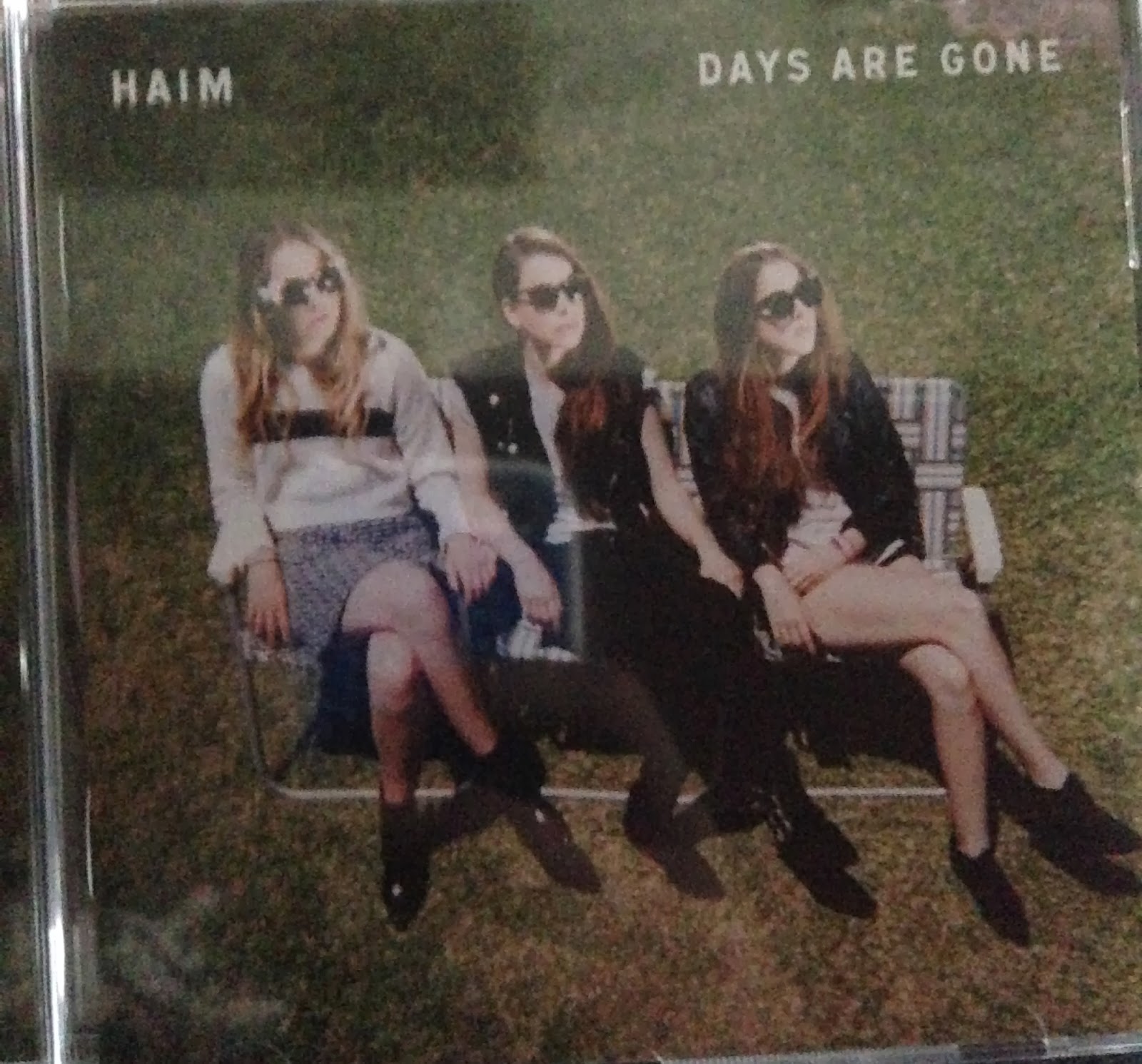
Front
Middle
Back
Haim are a modern alternative band which have received a lot of critical acclaim upon this release. They often play concerts with other alternative rock bands and feature on Polydor, a label which is renowned for releasing this genre of music. The front cover of this album follows conventions used above in the Vampire Weekend artwork and others from this area of music. As a result of this, there is a simple design on the cover which includes a main image, the bands name and album title; that is all. This cuts straight to the point and draws in the audience's attention with a bold cover photo which is not that common in other artwork. Although due to demographic research (discovered on an anonymous question asked on the band Self Defense Family's website), it is shown that photographs draw in the viewers attention more than drawn or painted artwork. This is becoming a more common strategy.
The middle of the digi-pack uses other images which are similar to the front cover, however they are shown from a different angle and featuring zoom. This spreads to the image behind the CD which shows the grass patch on the front and middle before the CD is removed. The back of the digi-pack is not related to the front and middle however and sticks to the simple form of tracklisting and required information finishing the digi-pack in an easy to read, slick design. I intend to imitate this format on the back design of my digi-pack as it gives the audience a straight-forward way of receiving the information which they look at the back cover for.
Monday, 17 February 2014
Ancillary Text CD Cover Basic Layout
Front

There was one point in history when album artwork was often very excessive and overcrowded; this was to give the band as much of an image as possible bringing in an audience through drawing their eye whilst they look for music. This stage has passed where it is now more popular that artists will release records with minimalistic designs. It could be argued that this style has come as it gives the artist a professional appearance where they do not have to convey a lot of character in their artwork to have an impact, yet simplistic designs may also have a lot of symbolism.
Back

Subscribe to:
Posts (Atom)