Front
Middle
Back
Vampire Weekend used this artwork for their latest album Modern Vampires of the City as it matches the art used in their previous releases. The band are involved in the alternative-rock genre as one of the fastest 'up and coming' bands in the past two years, which could arguably be a result of the image that they give to their target audience. Generally, the audience is of a younger age (specifically 15 - 30 year-old), where the vintage style is very popular. Their cardboard casing for the artwork shows a floral design on the left third side of the CD which is used to stand out more to the audience. The cover applies to the theme of the album title as it shows a birds eye view of a city, relating to the title.
The centre of the CD features an insert with a variety of shots which reflect the themes of the album. Images used in the insert are often those which were almost going to be used as the front cover, yet weren't good enough. These are often created into fan artwork or stored by collectors. The back cover of this release is kept simple so that the track listing is bold and formal. Layout is essential on the back cover although some artists use excessive artwork, the alternative rock genre often keeps it simple with the essentials included (legal information, bar code).
Front
Middle
Back
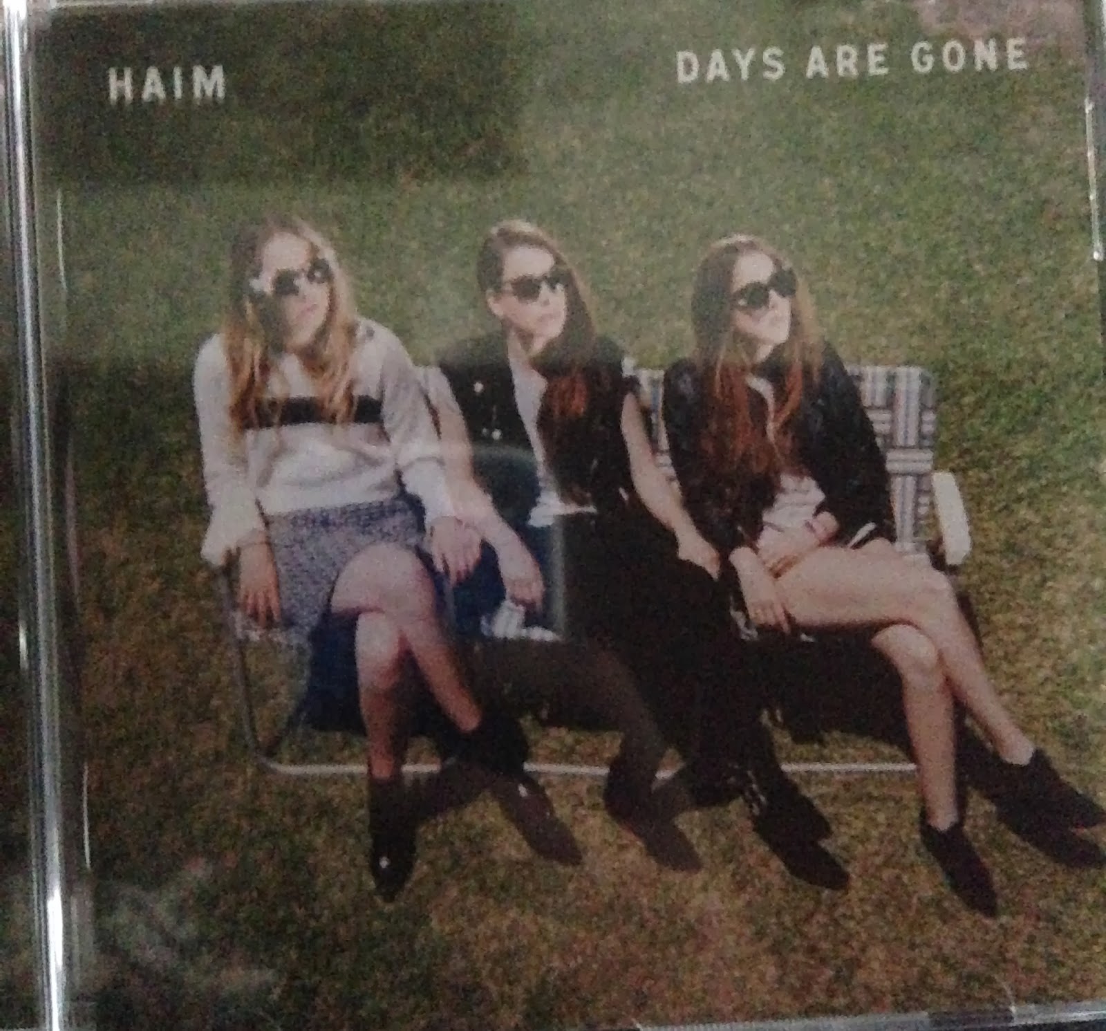
Haim are a modern alternative band which have received a lot of critical acclaim upon this release. They often play concerts with other alternative rock bands and feature on Polydor, a label which is renowned for releasing this genre of music. The front cover of this album follows conventions used above in the Vampire Weekend artwork and others from this area of music. As a result of this, there is a simple design on the cover which includes a main image, the bands name and album title; that is all. This cuts straight to the point and draws in the audience's attention with a bold cover photo which is not that common in other artwork. Although due to demographic research (discovered on an anonymous question asked on the band Self Defense Family's website), it is shown that photographs draw in the viewers attention more than drawn or painted artwork. This is becoming a more common strategy.
The middle of the digi-pack uses other images which are similar to the front cover, however they are shown from a different angle and featuring zoom. This spreads to the image behind the CD which shows the grass patch on the front and middle before the CD is removed. The back of the digi-pack is not related to the front and middle however and sticks to the simple form of tracklisting and required information finishing the digi-pack in an easy to read, slick design. I intend to imitate this format on the back design of my digi-pack as it gives the audience a straight-forward way of receiving the information which they look at the back cover for.


No comments:
Post a Comment