Before creating my poster for my ancillary text, I believed that it was necessary to perform some research into the strategies that bands and record labels use when making these advertisements. Although I was already familiar with the idea of making a poster for a film, it was slightly different when I investigated the posters that are made for bands' records. Initially, I wanted to create a poster which was slightly different and eye catching as this is what Radiohead tend to do with a lot of their advertisements. After analyzing a few things about these posters, I had a brief idea of what I wanted to create.

This is the advertisement for Manic Street Preachers' most recent album, Journal for Plague Lovers. As it fits a relevant genre (alternative) for the Radiohead advertisement which I am making, it gave me an idea of what kind of layout is needed for the poster. The album artwork is the most bold image on the page, not only because it is a powerful piece of art, but because it uses a range of colours against a white background which makes the album seem more outstanding. The font type for the details beneath is very basic yet brings the point across appropriately with a professional appearance. As Manic Street Preachers are a very old band, it shows that they do not need to adhere to popular culture and trends in their advertising and the album is displayed as the only focus. Beneath the release date, it includes details about the lyricist, musicians and producers, this is mainly because they belong to an independent label and wish to give credit to those involved. In smaller print, it shows that you may purchase the album from online retailer 'Amazon' as well as showing their website and record labels' logo, which is usually mandatory for the bands on their label within the advertising.

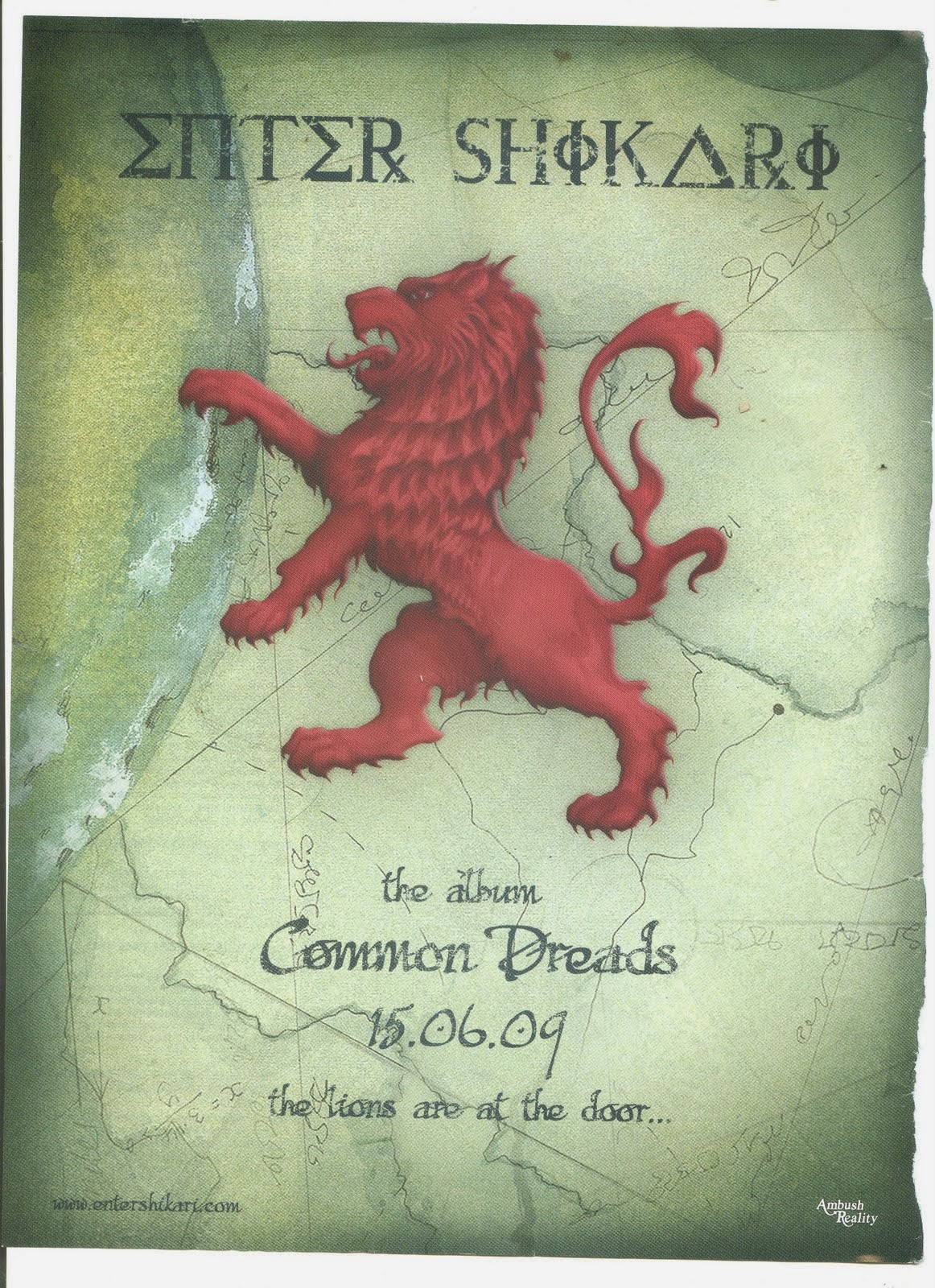
This advert is for Enter Shikari's penultimate album, Common Dreads. Although this is a slightly different genre, the target audience of the bands music is fairly similar to that of Radiohead's in this modern era. The poster uses the artwork from the album and blows the background of it up so that it fills the page. This is a great strategy although it may be harder to do this on my own work and could give it a messy appearance. None-the-less, Enter Shikari have used the conventions needed in an advertisement which displays the bands name, title of the album and release date. The band have also used a tagline at the bottom which is included in a song from the teaser trailer that they released after the announcement of the album 'The lions are at the door'. The font which has been used has synergy with the background as they both show an older style. The band's website and record label are also included at the bottom corners.

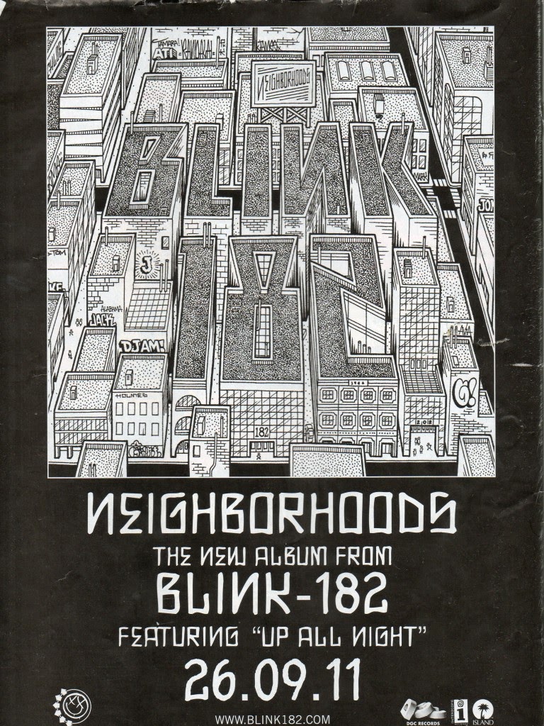
The third poster which I researched was Blink-182's newest album 'Neighborhoods'. This uses a similar style to the Manic Street Preacher's album which I looked at first; this is because they both use their album artwork as the main focus at the top. All of the posters featured include the most important information at the top of the page leading to the bottom whilst all of the text is centred for a clear layout. They both also use contrasting between colours so that the font and album artwork are as bold as possible to the audience, potentially creating a sense of recognition for when they may be in a record shop. As the writing of the bands name on the front cover is not very clear, they have written 'The new album from Blink-182' beneath the album title in case the person reading could not see it well. Different to the other advertisements, the band have included a subheading reading 'Featuring
Up All Night' which is a song that they have recently been well known for following their return to making music. This tactic is used to create recognition for the audience however it is mainly used by more popular bands or those featuring in magazines with different target audiences. Again, the bands website and record labels are shown at the bottom; however through further research in other posters, band websites are being used less in more recent examples and being exchanged for Twitter hashtags. The band also include their old logo in the bottom left corner for more recognition as the audience that they received before breaking up may have forgotten about them.


